First Presbyterian Church of Ann Arbor
Website Design
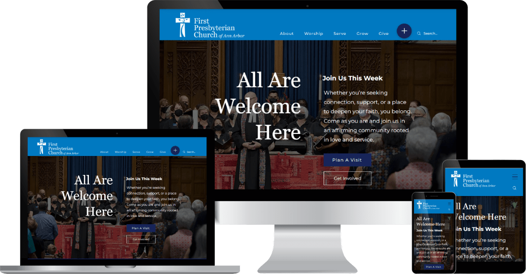
First Presbyterian Church of Ann Arbor sought a digital presence that would mirror its vibrant, diverse community.
The project called for a website redesign that combined warmth with functionality, extending the church’s hospitality into the online space.
The new site presents a modern, welcoming interface with clear navigation and engaging visuals. Worship opportunities, programs for all ages, and pathways to connection are given prominence, ensuring both members and newcomers can easily find ways to participate. The result is a digital platform that balances clarity and accessibility with a sense of community and belonging.
Whitewater Valley Presbytery
Logo & Website Design
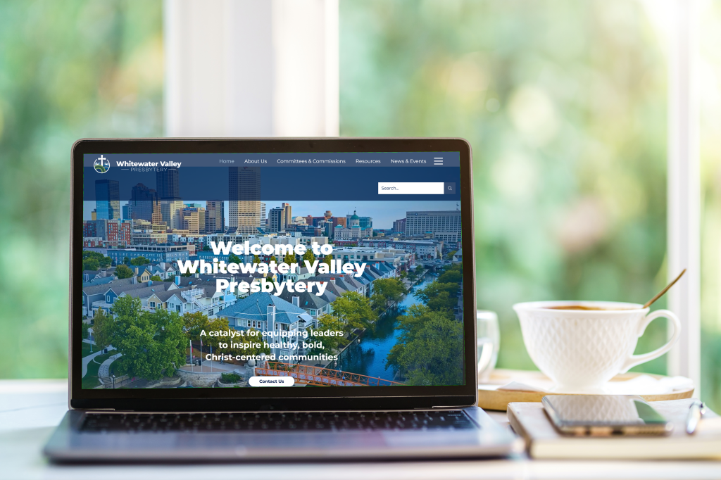
Whitewater Valley Presbytery sought a refreshed identity and digital presence that would communicate its mission with clarity and warmth.
The project brief called for a logo and website redesign that honored the Presbytery’s heritage while presenting a modern, approachable face to its congregations and wider community.
The new logo introduces a clean, contemporary aesthetic while retaining visual cues that reflect the Presbytery’s values and identity. The accompanying website was designed with an emphasis on accessibility and ease of use, offering streamlined navigation and a welcoming interface. Together, these elements create a cohesive brand experience that supports connection, strengthens communication, and reflects the vitality of the Presbytery’s ministry.
Trinity Presbyterian Church
Microsite Design
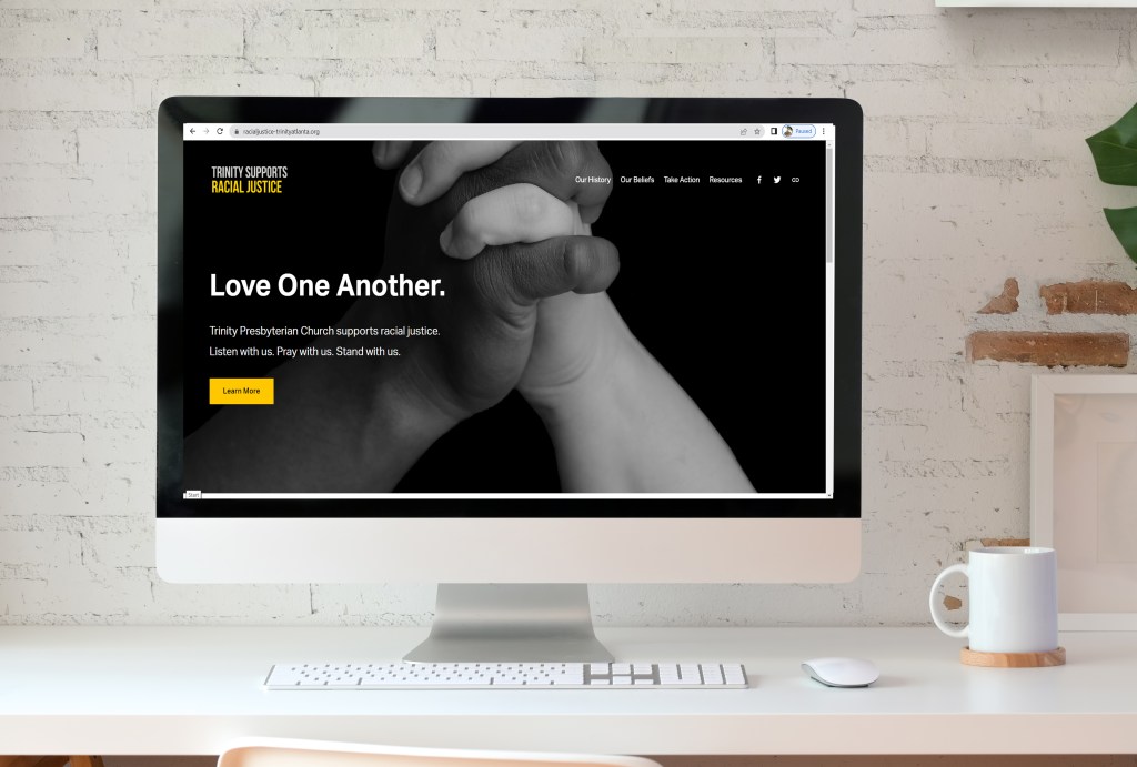
Trinity Presbyterian Church’s Racial Justice Ministry required a dedicated digital platform to communicate its mission and invite meaningful engagement.
The project called for a micro-website that balanced clarity with visual impact, ensuring resources and events were easy to access while reflecting the ministry’s values of justice and inclusion.
A streamlined layout, bold typography, and intuitive navigation were paired with a responsive framework for seamless use across devices. Color choices and imagery were carefully selected to evoke warmth and equity. The result is a focused platform that amplifies the ministry’s message with both distinction and accessibility.
